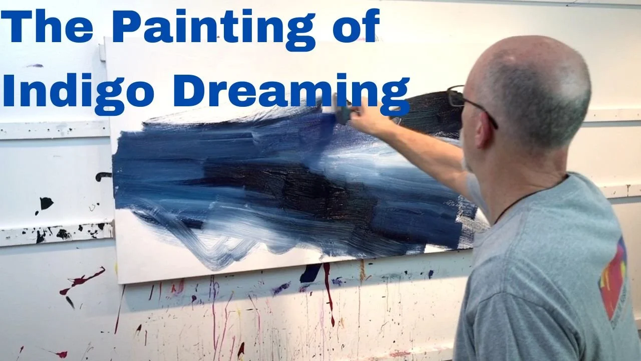
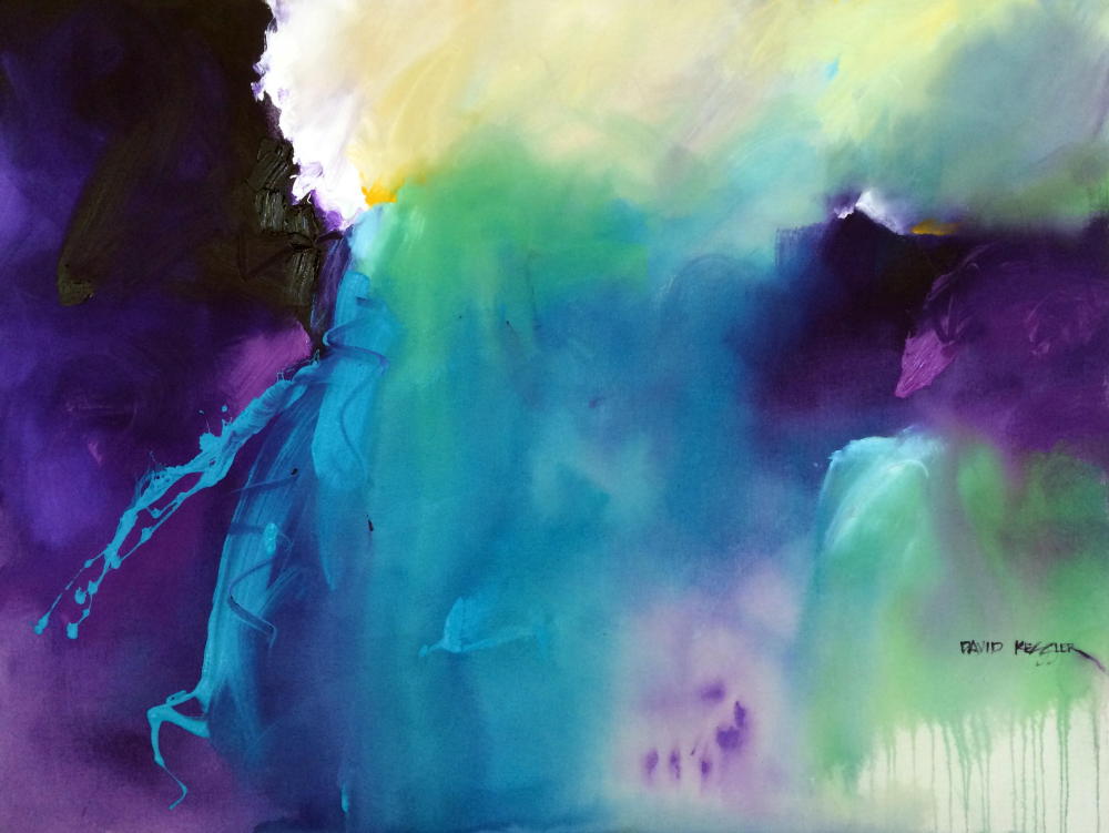
|
Home
Paintings
Artist Profile
Contact
Blog
Email Newsletter
Galleries
News
Links
|
by David M. Kessler on 8/29/2010 2:42:48 PM
It is always amazing to me the progress that is made each year as a painter. I have been painting acrylic abstracts non-stop for the last year and as I look back over that time I can see that the body of work is cohesive, but has improved dramatically. I would be worried if it had not improved, if I had not made progress, if I had not moved forward. As artists, we all change and modify what we do according to our experiences, wants, needs, desires, and talent. It is often difficult to go through, this metamorphosis, but when you look back it is a delightful thing to see.
My new abstract series is called "Milagro", spanish for miracle, because the last year of painting has been a miraculous one for me. These are nice, small gallery wrapped canvases that will be framed with a modern black floating type frame with gold trim.

"Milagro 1"

"Milagro 2"

"Milagro 3"
These paintings can be purchased separately, but are really made to be purchased together, and the price will be discounted accordingly. If you are interested in these works let me know because I expect them to go quickly.
Until Next Time,
David
Comment on or Share this Article >>
by David M. Kessler on 8/15/2010 4:06:40 PM
Comment on or Share this Article >>
by David M. Kessler on 7/17/2010
 "Urban Grit" by David M. Kessler
Sometimes the unexpected happens when painting - OK, usually the unexpected happens - and I think to myself, it is better to be lucky than good. This was the case with the painting above, "Urban Grit". When I started the piece my intention was to use a rich, dark background mix of colors, then add lighter values over it. I had not tried this appoach before so I began painting. I painted the dark layer, let it dry (which is something I almost never do) and began to add the lighter value colors, most of which were the same colors used on the underpainting with white added.
As I painted I couldn't seem to get the edges of the lighter colors to blend - because I let the underpainting dry first! I continued to paint, but I couldn't seem to make anything work. I was about to throw in the towel and get out the gesso. But being one who takes defeat poorly, I quickly adjusted my attitude and took a different approach. Figuring all was lost anyway, I grabbed my notched trowel - which I use to occasionally provide texture to my work - and began to scrape it across the canvas in every direction.
This began to not only create interesting lines and textures, but revealed the darker values underneath in exciting ways. It had a very scratchy sort of look and feel that I was not entirely satisfied with, but I kept at it laying in color and moving it with the trowel. The more I progressed, the better I liked it. I let it sit a few days then went back in to refine a few shapes.
The scratchy surface textures and dripping paint reminded me of the sides of buildings that one may find in blighted areas of cities. Buildings that have a long history of being uncared for and maybe vandalized with grafitti. Therefore I chose the name, "Urban Grit". As I have lived with it for a few weeks it has become one of my favorite paintings, and I just completed a second in the "Urban Grit" series. The new one, which I will share in a future blog, is made from warm colors.
Until Next Time.
David
Comment on or Share this Article >>
by David M. Kessler on 6/26/2010
I just returned from visiting the traveling exhibition from our country's most prestigious watercolor society - what a disappointment! First, though let me say that the pieces all looked very professional, and were well crafted even though some of the frames were pretty lousy.
The traveling exhibition is comprised of many of the award winners from the 2010 international exhibition. I was expecting to see inspirational pieces that would make me want to hit the studio. Instead I saw many pieces that looked like they were painted in anything other than watercolor. Many were painted with opaque paint, so there was no glow of watercolor there - no use of the medium as it was meant to be used.
My biggest disappointment however was the lack of energy and spontaneity which is what I crave when I look at artwork. Instead these works were all maticulously rendered, as realistically as possible for the most part. What has happened to watercolor societies that they no longer value more energetic work? Why have they all gone toward realistically rendered pieces that have little or no life to them? They all appeared to be slaved over for days at a time, with no color outside of the lines - what lines, I didn't even see a pencil mark!
The best piece for me was painted by Dan Burt who is a wonderful artist from Texas. His book "You Can Paint Vibrant Watercolors" is one of my favorites, and I had the privilege to see another of his works in person severla years ago. They are so alive with expressive color and brushwork - truly inspiring for those of us who will never attain that level of craft.
One of the things that really shocked me was one of the award winners completely copied the style of a wonderful portrait painter named Ted Nuttal. He has a very distinctive style that this person has completely copied even down to the way the painting was floated in the frame - and she won an award for it! Can you believe that?! Here is the painting , you can judge for yourself.
Eric Wiegardt, a watercolor painter with a wonderfully loose style wrote an article last year with similar misgivings about today's watercolor societies - you can read it here.
I just had to vent, but I feel better now.
Until next time.
David
Comment on or Share this Article >>
by David M. Kessler on 5/31/2010

"Who Can't be Topical?" by David M. Kessler
Artists need knowledge and discipline to adequately harness the power of spontaneity. Say what?
Let me explain. As I mature in my painting abilities, I am more keenly aware of the importance of spontaneity in one's work. Spontaneity allows you to free your mind and let yourself go; it promotes freedom; it contributes to personal creativity. I believe that the most important attribute of spontaneity is that it allows you to turn off your analytical mind so that your creativity can shine through.
But if there is no knowledge base of design elements or painting discipline, then spontaneity cannot be thoroughly channeled and utilized. If you are spontaneously painting with no idea of how to develop a center of interest, manipulate values and color, or develop a good composition then what have you accomplished? The key is to have a great knowledge base and the experience of a seasoned artist to draw from - of course you should have this regardless of spontaneity - to create good art.
When you are in the heat of the moment with brushes going everywhere, arms swinging, paint flying, body moving to the beat of the music (this is what happens while I am painting my abstracts!) you are in the zone, and you don't have time to think about design - it has to be second nature - honed through hundreds of paintings and acres of paper or canvas.
I approach my abstract paintings in exactly this way. I have no preconceptions of what will happen, only that I will let spontaneity and creativity reign. I approach the canvas in a fast and furious manner so that my analytical mind is shut off, allowing my creativity to be front and center. Without my knowledge base learned from years of study and hundreds and hundreds of paintings, I would flounder about with no direction, and no ability to develop the structure for a painting. Once the flurry of activity is over, then the analytical mind takes over so that I can adjust parts of the painting as required to strengthen and complete the work.
My watercolors, by contrast, are structured and composed prior to the application of paint through the use of design/value studies. With a less abstract work, I cannot afford to have a poor concept from the start. However, once I commit paint to paper I let spontaneity take over. The work of the composition is already complete, so analysis at this point has already taken place. I go wild with color and paint application so that the final work has a fresh, spontaneous look and feel. After I believe the work to be nearly complete, I go back and analyze the work, make corrections if required, and complete the painting with my signature.
First learn the design elements for developing a strong compositional structure. Then unleash the power of spontaneity to create work that you didn't know was possible!
Comment on or Share this Article >>
by David M. Kessler on 5/13/2010
I just love Spring! The flowers and trees are blooming; color is everywhere; the sky is just the right hue of blue, and the sun begins to warm everything it touches. It even inspires color palettes for paintings, like the one below.
"Spring has Sprung"
Before Spring arrived I completed a series of paintings inspired by primary colors. The yellow paintings are entitled Calido because they radiate a sunny warmth (Calido being the Spanish word for warm). The blue paintings are entitled Fresco because I get an icy cool feeling when I look at them (Fresco being the Spanish word for cool). The red paintings are entitled Caliente because they are soooo hot! (Caliente being the Spanish word for hot). The paintings are 12x12 each on gallery wrap canvas. I sent 1 of each color to each of my three galleries.

Calido 1 Calido 2 Calido 3
Fresco 1 Fresco 2 Fresco 3
Caliente 3 Caliente 5 Caliente 4
As I wrote in my blog post earlier this week, my wife Terri adn I have been doing a little spring cleaning at our house. In so doing I ran across not only some old paintings, but my value studies, many of which I never documented by photographing them. So I spent time photographing more than 100 of them. I have included a few here, just to remind everyone how critical it is to develop a value study before you paint. Some of these studies I like more than the resulting paintings, I think because they are so raw and loose. They look spontaneous, but each is thought out and constructed according to the elements of design which I have discussed previously.

I also like the fact that some of these sketches have an abstract quality to them, which is what I often strive for in my basic design for paintings. The abstractness comes from the patterns of light and dark, and the arrangement of the shapes.
I know there are some great artists out there that read this newsletter, so let me see some of your work - both finished work and sketches. Just email them to me at david@davidmkessler.com.
In closing I would like to thank all of you who continue to support my art by viewing my website, reading this newsletter, patronizing my galleries, and collecting my work. It wouldn't be nearly as much fun without you!
Until next time,
Happy Painting!
David
Comment on or Share this Article >>
by David M. Kessler on 4/26/2010

"The Haybarn" Early Watercolor by David M. Kessler
A theme around our house lately is "cleaning out". We have lived in our house 15 years and things tend to collect. We have engaged in a process to slowly remove items we don't need, and begin some minor remodeling in an effort to spruce our place up a bit.
Today I was cleaning out a closet with an old portfolio stuck in the back. I had some drawings in there from my college days that I had not looked at in at least 20 years. But I also came upon many watercolor paintings and sketches that I had done in the first three years that I began to paint. It brought back to me the great struggle that I went through to be where I am today.
The process of learning to paint, at least for me, was a slow one. Watercolor was my first love, so I took a few classes at a local community college with less than average instructors. Today it is commonplace when taking classes that the instructors actually paint, but in the early 1990's evidently it wasn't. I don't know if the instructors did not want to paint of if they didn't know how, but I never saw anyone actually paint a watercolor painting for several years! Can you believe that? One day I saw an ad somewhere for a Frank Webb painting video. I thought finally a chance to actually see someone paint. The video was certainly enlightening, but still I struggled.
Not only did I struglle with the watercolor techniques, I struggled with the development of compositions, the idea of values, etc. I thought to myself if I can't find adequate instruction locally, I'll get books and videos and teach myself the elements of design, application techniques, etc. So that is what I did. I bought books by painters whose work I admired, like Frank Webb, Edgar Whitney, Tony Couch, and Tom Lynch. I studied an absorbed everything in them like a sponge. My painting improved only marginally so I stopped painting altogether - but I never stopped studying and fomulating ideas. I stopped painting for about 7 or 8 years! This off time gave the seeds that were sown by my study time to take root in my mind.
When I was ready and the time seemed right, I began to paint again. I was beginning to make things happen as I had imagined them. Then a funny thing happened. An older lady in my painting class, who I had grown to love, told me about a painter in my area that I should take lessons from. His name was Sterling Edwards. I looked him up and found that he was giving a weekend workshop a couple of weeks from then so I signed-up. Keep in mind I had still never seen anyone paint live in front of me, only on video.
That weekend changed my life forever. Through Sterling's painting demonstrations and encouragement, something in my head jsut clicked into place. I finally had it! I understood it! I got it! After more than ten years of struggling to find my way, my voice, my techniques, I was finally on my way. All of the years of study, and trial, and work, and experimentation had finally paid off. By the way, I still have the painting I did that weekend (shown above).
Since that time I have never looked back. I continue to paint 75-85 paintings a year, and love every minute of it. I still have struggles, but now I know that I can overcome anything I encounter. I have never had a creative block, and the ideas continue to flow.
Remember friends, you can do it just like I did. Have patience and work hard at it and you too will become a better
painter.
Comment on or Share this Article >>
by David M. Kessler on 4/7/2010
"Fresco 1", "Fresco 2", and "Fresco 3" (12"x12" each) form a new series of acrylic abstract paintings. This group of paintings are a continuation of the "Caliente" series described in the previous post. The "Caliente" series concentrated on warm reds and oranges, this series concentrates on cool blues and violets, and the next series will focus on warm yellows and greens.
Fresco is the spanish word for cool. I thought it the perfect title for paintings with such cool, icy colors. Each of these paintings were created with a rich variety of blues and violets including cerulean blue, cobalt blue, ultramarine blue, indigo blue, magenta, and deep violet. I splashed in just a bit of warm yellow and yellow green at the center of interest to make them pop.
In addition to the visual variety of color there is ample tactile variety as well. Some of the texture was created by scraping in line work with a brush handle, and still other textures were created from layering and varying the thickness of the paint. As always I was careful to have a variety of light and dark values and hard and soft edges.
I have one of these at each of my three galleries, so if you are interested, please send them an email.
Comment on or Share this Article >>
by David M. Kessler on 3/12/2010
Caliente 3 Caliente 4 Caliente 5
These paintings are hot! They're smokin'. They're burning out my retinas!
I have a new painting series called "Caliente", Spanish for Hot. I came up with the name after the paintings were complete. The richness of the reds, oranges, and yellows reminded me of flames and heat - or maybe it was the latin music I was listening to while painting them that led me to the name. The three paintings above are all 12x12" and can be displayed horizontally, vertically, or diagonally. They can be purchased separately and are not exclusive as a group.
Because they have such rich, wonderful color I can imagine someone buying one of them for a very special place in their home of office that needs a shot, or pop, of color. What a beautiful exclamation point any of these would make. And at a price of only $200 each, they are a great deal.
Because they are small, they were all painted at the same time utilizing the exact same colors in each which are a combination of reds, oranges, yellows, and violets. The only coolness at all comes from the violet. I really enjoy painting in a series of three using these small canvases. I will have other color series to follow; I am thinking of blue dominate, yellow dominate, and green dominate series to go along with these red dominate paintings.

Caliente 1 Caliente 2
The two paintings above were the first two in the series and they are 18x18" each.
Comment on or Share this Article >>
|
|