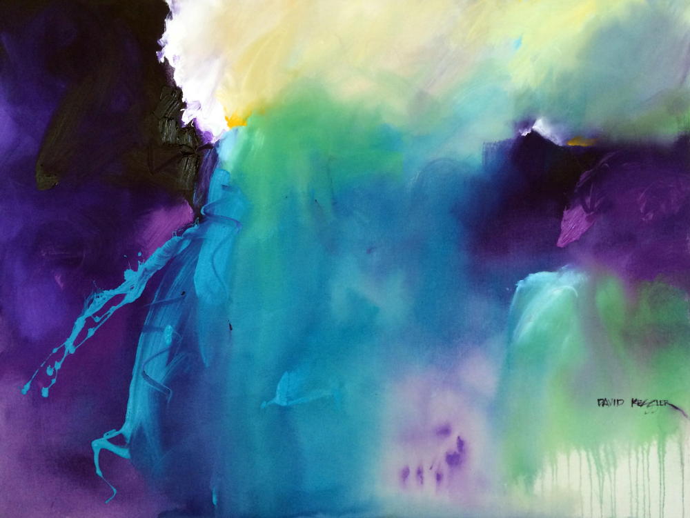
Painting "Jewel Tones 2" - REWIND
/
Painting "Jewel Tones 2" - REWIND
This painting video was originally posted back in early 2016. This version is a updated with new music and and some new graphics. The original video has more than 90,000 views, which is really good for one of my videos.
I always loved painting this piece and I enjoyed it in the studio until it sold. There was lots of intuitive paint splashing and working directly from the paint containers with very little mixing of color on the palette. The color combo is a primary triad of yellow, red and blue with red as the dominant color, yellow as the accent color and blue as the non-dominant color. There is some violet and orange added in too, but not enough to distract from the main triad.
I was using about half Golden Heavy Body Paint and about half Nova Color Paint at the time, just prior to my switch over to Golden Paint exclusively. I have listed colors from both manufacturers below.
I am working on a 48x48 Gallery Wrapped Canvas covered with gesso. The Golden Heavy Body Acrylic Colors used are:
Light Violet
Quinacridone Magenta
Dioxazine Purple
Blue-Violet (custom mixture)
Titanium White
The Nova Color Paint colors used:
Hansa Yellow Light
Indian Yellow
Organic Pyrrole Orange
Fluorescent Pink
Fluorescent Magenta
Phthalo Turquoise
As with most of my paintings there was no pre-planning of anything other than the color combination. I like to paint intuitively so that I can be as spontaneous as possible when I stand before the canvas. All I knew was I wanted it to be a very warm painting.
I start with Quinacridone Magenta with a bit of Dioxazine Purple added to darken it enough to create a dark value for the painting. I add some orange to warm up the cool reds. I continue adding middle value color in both warm and cool varieties. I leave little white space to place my main yellow accent. I first put in the Indian Yellow, followed by Hansa Light mixed with Titanium White.
The remainder of the time was spent adding color variety, working the edges of my shapes and splashing on some paint for added visual interest and paint thickness.
It was one of the most fun paintings I’ve done. It’s nice to revisit it to remind myself of the experience. I hope in some way it is helpful for you and your art journey.
If you'd like to learn about abstract painting and making your own authentic work, then please join me for a painting workshop: (You can view a list of workshops HERE)
October 8-10, 2021, “Abstracting the Coastal Landscape “ Fort Walton Beach, FL
Arts and Design Society (ADSO). Click HERE for Information and Registration.October 26-28, 2021 “Bigger, Faster, Fresher, Looser Abstract Painting” Daytona Beach, FL
Art League of Daytona Beach, Click HERE for Information and RegistrationNovember 3-5, 2021 David M. Kessler Fine Art Studio, Winston-Salem, NC. This is a Studio Workshop in Abstract Painting. Click Here for Information and Registration. Only 2 Seats Left!
November 13-14, 2021 Art of the Carolinas, Raleigh, NC. Sponsored by Jerry’s Artarama. I will be teaching two full-day abstract painting workshops. Click Here for Information and Registration.
As always, thanks for your support!
David

Simple Color System Colorwheel
If you have seen my videos on YouTube or taken one of my workshops, you have seen me use my Simple Color System Colorwheel. My Simple Color System is easy to use and assures that the color in your paintings will be harmonious. Proudly made in North Carolina.
You can purchase the Colorwheel HERE.

ALL ABOUT COLOR is a great online course that will show you a straightforward, no nonsense, clear and easily understandable approach to using harmonious color in your paintings. Now On Sale for $50 Off!
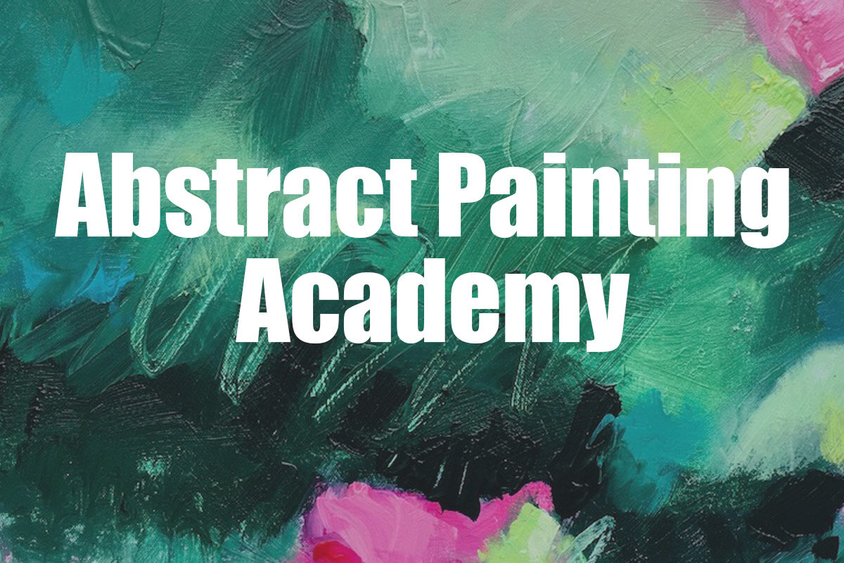
Abstract Painting Academy is an online workshop experience specifically designed to teach you how to paint Abstract Paintings (like only you can!), Loosen Up your painting style, and use Design Fundamentals to give your paintings Dynamic Visual Impact. You get David’s personal attention and feedback on all of your work during the course. Now On Sale for $100 Off!
Click Here to Find Out More

The Painting Insider (formerly Abstract Painting Insider) now has a new format and is not abstract painting specific. Weekly lessons provide an abundance of information to painters at any level. I have poured information about everything I have learned about painting over the last 30 years into one course!