Get Your Paintings Into Shape
/ "A wonderful painting is made of wonderful shapes."
Frank Webb
One of the most difficult things to learn as one begins a journey in painting is to think of the world as a combination of flat shapes rather than realistic objects. Objects and three-dimensional "things" in the real world must be translated into flat, interconnected "shapes" when one designs compositions for paintings on a two-dimensional plain of paper or canvas. This difference in "seeing" is often challenging for amateur artists. Students generally have to draw and paint awhile before this notion sinks in. Understanding shapes is a basic necessity in learning how to compose a good work of art.
What are shapes? Shapes are all of the areas of your painting. They are usually distinguished by contrasts in value, contours of line, or color. All works of art are made up of shapes. Take an old painting or drawing on paper sometime and cut out the major shapes to see how interesting they are. Often this exercise will help you see shapes more easily and will lead to the development of better, more interesting shapes in future work.
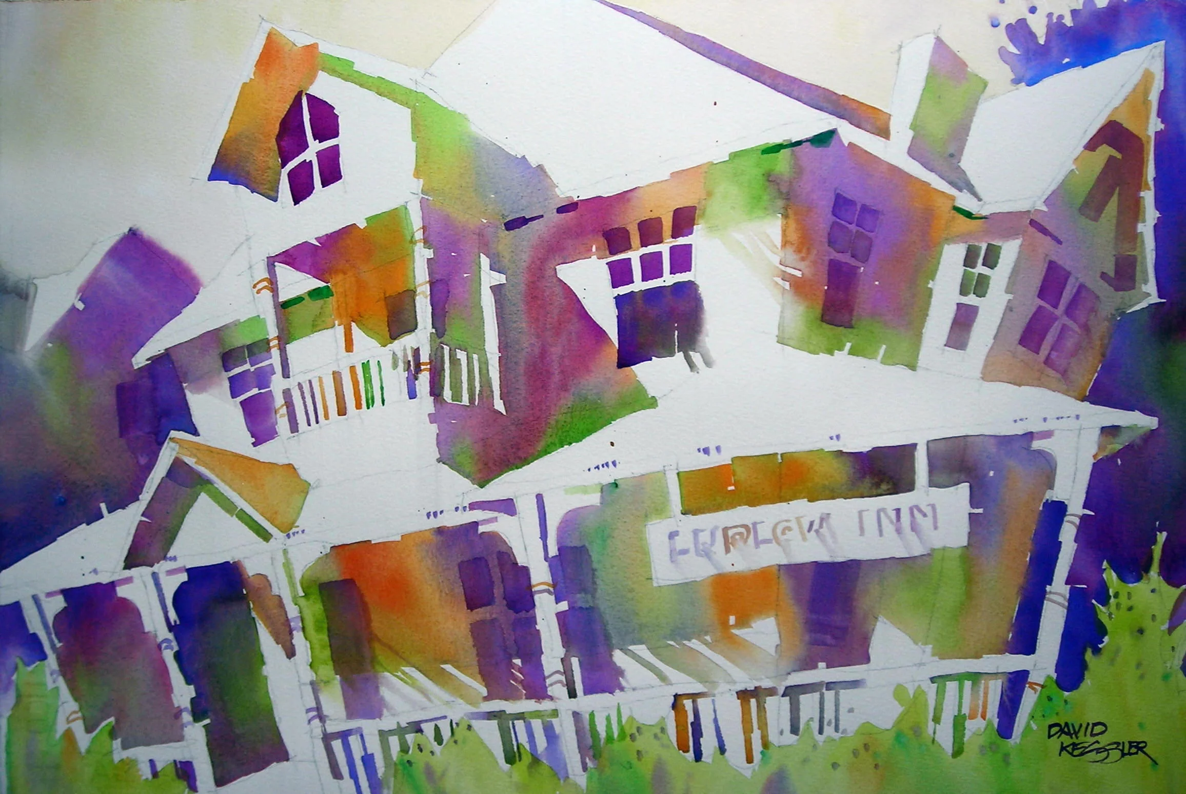
Look at the "Ludlow Inn" painting above. It has some very well designed shapes. Here the shapes are divided into shapes of light and shapes of shadow. Trace all of the light areas and notice that they are all interconnected from one side of the painting to another. Then look at the shadow shapes. They are also all connected together as a single shape. This is a favorite technique of mine that makes me concentrate only on the shapes and how they connect. Notice that the shadow shapes all have color gradation but maintain a consistent value throughout the painting.
"Make each area an interesting shape and show gradation
within it." Edgar Whitney
What makes interesting (good) shapes? Interesting (good) shapes are those that are stretched so that one dimension is longer or wider than the other. They typically have interesting edges that interlock much like pieces of a jigsaw puzzle. They have a slant or movement in our out of the picture plane, but not parallel to it. Shapes should overlap their neighboring shapes to create a sense of depth. No other spatial sensation can countermand that of overlapping shapes. Shapes can be positive or negative. Often we think of the main subject matter as the positive shape and the spaces surounding it as negative shapes, however the positive / negative roles can be reversed.
The more intersting the edge of the shape, the more interesting the shape, and the more likely it will interlock with other shapes to form a tight composition that is not easily pulled apart. Shapes should also vary in size. Legendary watercolor instructor Edgar Whitney used an easy-to- remember example of the sizes of shapes to use in a painting: they should be papa, momma, and baby sizes.
"When the whole and the parts are seen at once, as mutually
producing and explaining each other, as unity in multeity,
there results shapliness." Samuel Taylor Coleridge
Integrate Shapes. I had a visiting professor in architecture one semester, Mr. E. Fay Jones, that summed up the quote above more succinctly: "The part is to the whole as the whole is to the part." I believe Frank Lloyd Wright also had some authorship in that saying. It is one that has always stuck with me in both architecture and painting. The key point here is that all of the shapes of the painting must work together to support the entire piece and maintain it's integrity, even the smallest shapes and details.
"No kissing please, as this creates a weakly connected shape
which will distract the viewer's eye, causing a momentary
pause as they puzzle it out." Marion Boddy-Evans
Develop Passages. I love the quote above because it so aptly describes two shapes that barely touch each other. Rather than creating a passage between shapes a "kiss", or weak connection, is a distraction to the eye and actually discourages passage. To keep the eye moving through a work of art solid passages between shapes are required. All shapes should not be totally defined by an outer edge, but must sometimes blend into a neighboring shape to create a visual passage between them. This will allow the eye to move freely between shapes and travel through the painting. An experienced painter can use this technique to lead the eye on a pre-determined path through the painting.
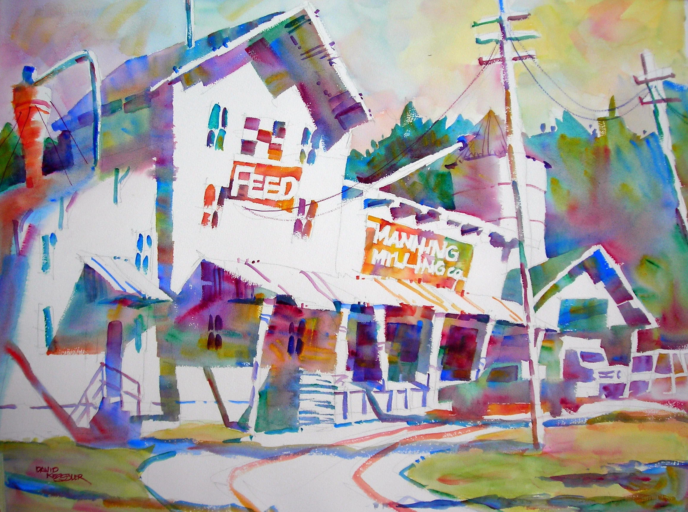
Notice in the painting above, "Manning Milling" the passages between the white shapes that flow across the page. Like "Ludlow Inn" the shadow shapes do the same thing. Passages are developed because the shadow shapes or light shapes interconnect across the page. This allows multiple planes of space to connect together to unify the work and provide a route for the eye to move through the painting. If you were to cut out the shapes you would find that they are merely abstract patterns put together in such a way as to create a fairly abstract view of a building.
The next time you are about to begin a wonderful work of art think first about how to create wonderful shapes that will Get Your Painting Into Shape!
If you want to learn to develop great shapes in your paintings, you can paint with me here or join one of my online courses.


