Don't "Photo-Copy" Your Next Painting-Updated for 2019
/Don’t Photo-Copy Your Next Painting-Updated for 2019
As artists we sometimes get into a rut using photographs from which to create our work. Photographs are easy because the image they contain is right in front of us. I find that nearly all beginning students completely rely on the image in the photograph as their composition - this is what I refer to as "photo-copying". This is not necessarily their fault because no one has ever taught them about the principles of design and how to utilize those principles to develop a composition. The design of the painting is really more important than the production quality of the finished work. The design is as much the "art" of a piece as the production.
The Camera Can Lie. The camera does not compose, it only records what is there - and usually in a spatially distorted format. The photographer (which may have been you!) may have composed a good photograph, but does that equate to a good painting? Probably not. If you are "photo-copying" you are settling for the subject as the camera sees it, or as the photographer saw it, not as you see it. As artist Frank Webb says, "don't simply paint what is, paint what could be."
Utilize The Principles of Design. In my own work I try to utilize the principles of design as I have learned them: Shape, Value, Color, Edges and Center of Interest. There are other principles that can be added, but I believe these to be the five basics.
If I use a photograph, it is only as a place to begin my composition; a spark for inspiration; a look or color or feeling. From that spark I use my sense of design to compose a scene that helps to express what I feel about the subject matter and shows how I want to communicate the subject to others.
Don't Just Document. Express Yourself. Generally, my intent is to express my joy of the subject I am painting; to communicate my impressions of the scene, the place, the subject. When students show me a photograph that they wish to paint, my first question is "what do you like about it?" This question helps them to really think about why they chose the photograph. We paint what we like, that is one thing that is so great about the freedom of art. But we have to know what it is we like so we can express the joy of the subject to others. What the student likes about the photograph is usually something that a design can be built around.
Try a Different Approach. The best way I know to create a good painting is by starting with a Value Study. Use the photo as a reference only to design the painting. DO NOT simply paint the photo. Here is my approach:
1. I create a line drawing using the reference only as a place of beginning. The photo is my idea, my spark, my inspiration – but not my painting. I use architects and engineers tracing paper for all of my line drawings and value studies. I can layer the tracing paper over subsequent versions to refine the composition.
2. Once the line drawing begins to express my intent, I need to assign values to ALL of the shapes in the drawing. I choose two different light source directions and develop a value study for each one. Please note that once you begin putting values on your shapes, you will most likely need to modify your line drawing a bit here and there to makes sure your shapes are fully defined one from another. I put the photo away, and never look at it again. I no longer need it because I have created my own reality for the painting.
3. Evaluate the two value studies to determine which you think will make the best painting. By creating a good composition and value study, you have done 80% of the work of the painting.
4. Enlarge the line drawing to the size you want to use and transfer the image to your substrate. Simply add the color according to the values shown in your value study and you’re done.
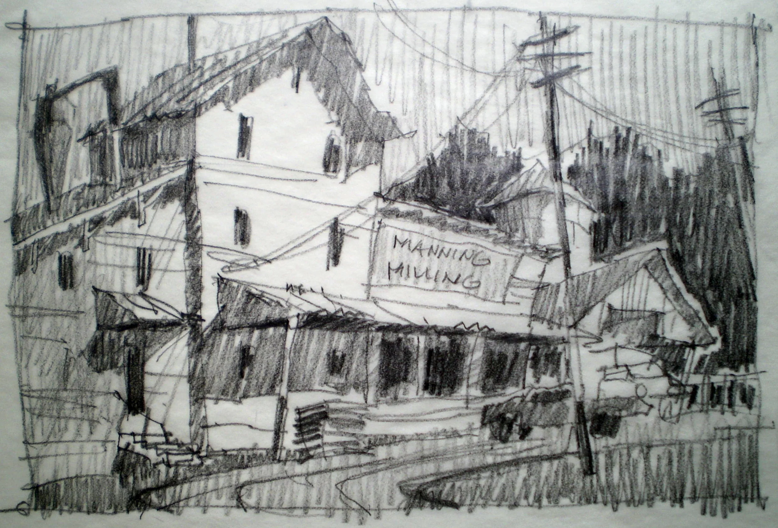
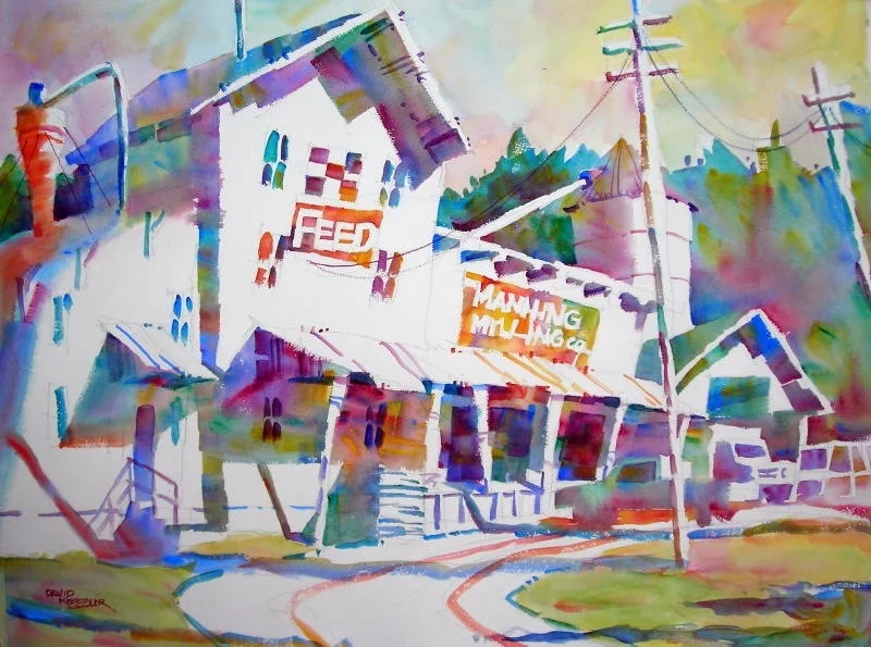
Example 1. Here I am showing the steps in my process. The reference photo is dull and gray and would make a horrible painting if copied directly.
I developed my value study and line drawing from the photo, changing the perspective and adding elements that you would typically find in a feed store. I have a memory of these buildings from my childhood - they were lively places with lots of metal signage and signage painted right on the building.
I wanted to recreate that in a painting, thus I used lots of beautiful color, mixing warms and cools to create a lively scene.
Reference Photo
Value Study
Finished Painting
Example 2. Here I am showing the steps in my process. This is the same building as example 1, just looking from the opposite corner. Again, the reference photo is dull and gray and would make a horrible painting if copied directly.
I developed my value study and line drawing from the photo, changing the perspective and adding elements that you would typically find in a feed store. I used a light direction facing the front of the building to best highlight the subject matter.
The resultant painting, in contrast to the reference photo, is lively, colorful and engaging - just what I was looking for.
Reference Photo of the same building, looking the opposite direction
Value Study
Finished Painting
If you'd like to learn about abstract painting, then please join me for a painting workshop: (You can view a list of 2019-2020 workshops HERE)
August 7-9 David M. Kessler Fine Art Studio, Winston-Salem, NC. For information and Registration Click Here. Sold Out!
August 23-25 Lowe Mill Arts and Entertainment, Huntsville, AL. For information and registration Click Here.
October 4-6 Arts and Design Society, Fort Walton Beach, FL. For more information and registration contact Hanna at hanna222@cox.net.
October 14-16 Sharon Serrago Studio, Richardson, TX. For information and registration Click Here.
October 24-26 Arizona Art Supply, Phoenix, AZ. For information and registration Click Here.
November 4-6 David M. Kessler Fine Art Studio, Winston-Salem, NC. For information and Registration Click Here. Sold Out!
November 16-17 Art of the Carolinas, Raleigh, NC-Sponsored by Jerry’s Artarama. For information and registration Click Here.
As always, thanks for your support!
David
P.S. If you you'd like to learn more about Abstract Painting in the comfort of your home or studio, I have a great course called Abstract Painting Academy available for you:
Abstract Painting Academy is an online workshop experience. It is my best and most thorough course covering everything you need to become a better abstract painter.
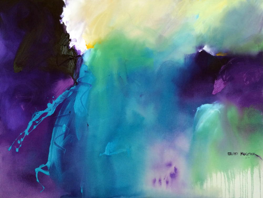
Subscriber Painting Discount. If you are a subscriber to my email list, one of the perks is a 50% discount on all paintings on my website over $300 - like the painting shown here. You’ll also get a free ebook just for signing up.
You Can Sign-Up and Become a Subscriber Here.
You Can View My Paintings Here. Use the Coupon Code: EMAILDISCOUNT at check out.


