The Tyranny of Symmetry

The Tyranny of Symmetry

Back in the day when I worked as an architect, my business partner Barry often talked about the Tyranny of Symmetry. Symmetry in building design is much like symmetry in designing a painting composition. The former in three dimension, the latter in two. They both share the same visual qualities: they’re stable, they’re static, they’re boring. Asymmetry on the other hand, has visual qualities of energy, movement and interest.

Read More
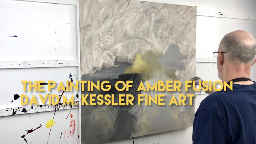
The Painting of "Amber Fusion"

The Painting of "Amber Fusion"

This is the third painting in my “Fusion” series. The paintings are my take on a monochromatic color combination where I am using one color family (multiple colors of yellow, in this case) plus black, white and grays. I am always hesitant to make a yellow dominant painting because they typically don’t sell and yellow can be hard to deal with, particularly when trying to make dark values. But, I thought I would give it a go, and I really like the resultant painting.

Read More

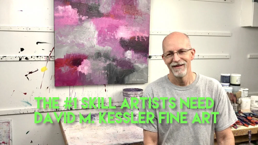
The #1 Skill Artists Need

The #1 Skill Artists Need

What do you think is the number #1 skill that artists need? I’m sure most will have differing opinions, but mine is that Drawing is the #1 skill that ALL artists need. I hear over and over again in my workshops from students (typically middle aged and above) that they have decided to take an abstract painting workshop because they didn’t know how to draw.

Read More