The Painting of Sunburst 4
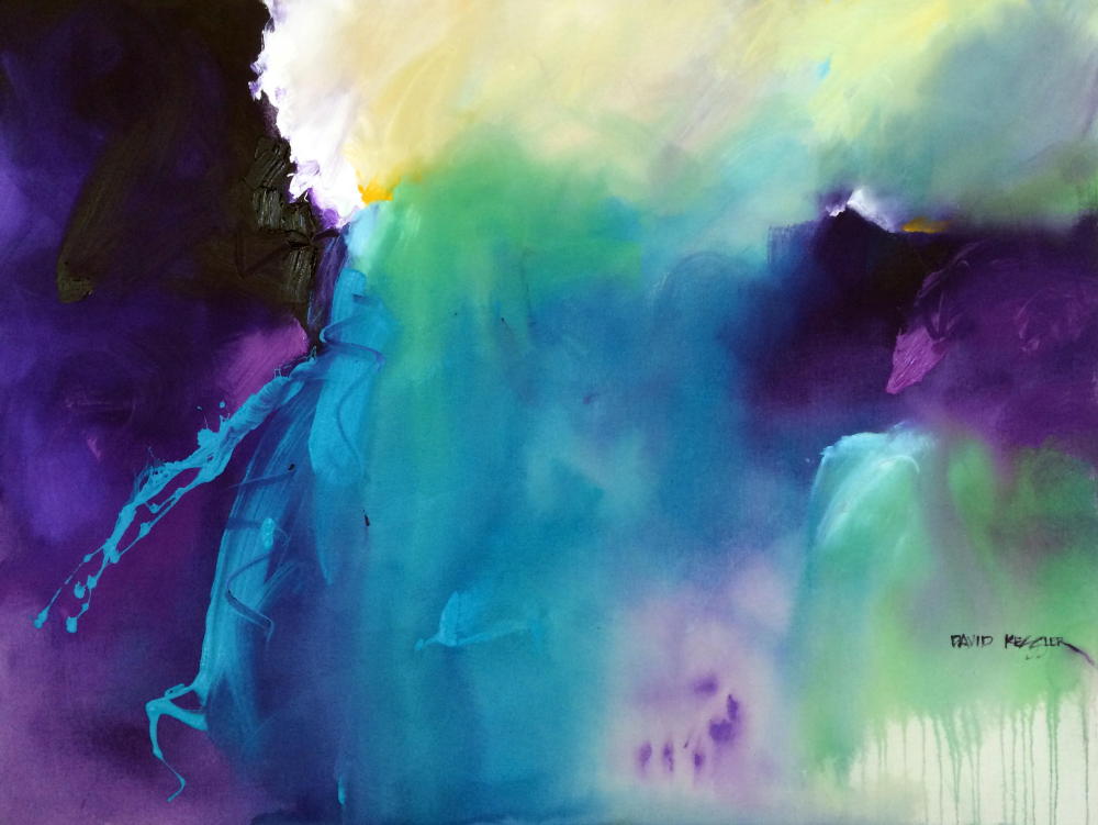
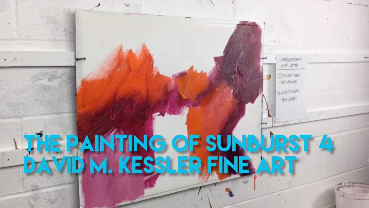
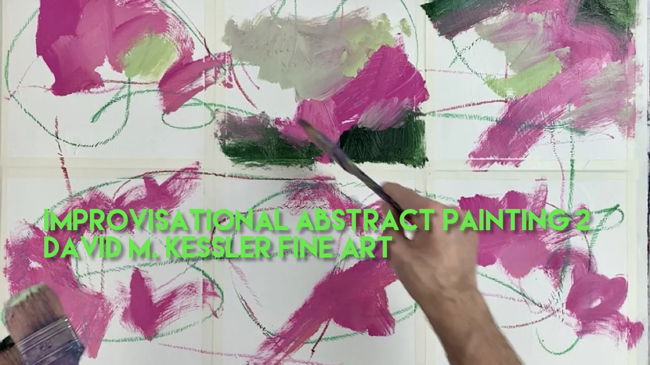
While this video was filmed several years ago, I enjoyed the process - and I hope you enjoy watching. I am painting with a simple complementary color combination of red-orange (dominant) and blue-green (accent), on 22x30 gessoed 300 lb Fabriano Artistico Watercolor Paper.
Here are the Golden Heavy Body Acrylic Paint colors I used:
Non-Golden Paint:
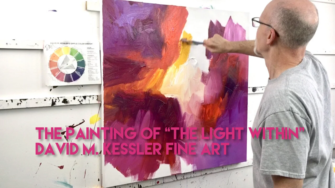
I tried to keep the colors simple, with very little mixing needed on the palette. As I often do, I begin putting in my dark value shape (straight Quinacridone Magenta) followed by some middle value orange. In this painting, I am trying to get some shapes and values on the surface before i place my centers of interest (accent color). Once I determine the placement, I strike those in using the Australian Blue Gum first, followed by the Minty G.
With my accents firmly in place, the rest of the painting process is simply filling in middle and light middle value color with my dominant color (red-orange). I adjust shapes, values and edges as I paint. It’s an intuitive process for me that I really don’t think about as I paint.
Once my accents pop, and I am satisfied with my shapes and values, the painting is complete. I don’t overwork. To me an overworked painting looks tired and even dead. I like to keep the painting as fresh and alive as possible.
If you’re interested in a great online course to learn All About Color, then Click Here for More Information.
If you'd like to learn about abstract painting and making your own authentic work, then please join me for a painting workshop: (You can view a list of workshops HERE)
October 8-10, 2021, “Abstracting the Coastal Landscape “ Fort Walton Beach, FL
Arts and Design Society (ADSO). Click HERE for Information and Registration.
October 26-28, 2021 “Bigger, Faster, Fresher, Looser Abstract Painting” Daytona Beach, FL
Art League of Daytona Beach, Click HERE for Information and Registration
November 3-5, 2021 David M. Kessler Fine Art Studio, Winston-Salem, NC. This is a Studio Workshop in Abstract Painting. Click Here for Information and Registration. Only 2 Seats Left!
November 13-14, 2021 Art of the Carolinas, Raleigh, NC. Sponsored by Jerry’s Artarama. I will be teaching two full-day abstract painting workshops. Click Here for Information and Registration.
As always, thanks for your support!
David
