The Painting of "Cajun Moon"
/
Te Painting of “Cajun Moon”
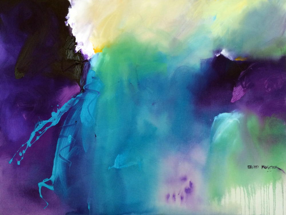
I taught a great workshop last week at a great, new to me venue in South Carolina. One of the demo paintings I did inspired me to use the same colors in a larger painting. The composition of the demo painting could have been better, so I am correcting it a bit in this larger, 36x36” gallery wrapped canvas.
Here are the colors I am using (all are Golden Heavy Body Acrylic Paint):
Benzimidazolone Yellow Light
Pyrrole Orange
Cadmium Red Medium Hue
Minty G (a custom color mixture of mine)
Teal
Jenkins Green
Titan Green Pale
Cobalt Turquoise
Anthraquinone Blue (mixed with Mars Black) I will refer to this as Indigo Blue
Cerulean Blue Deep
Cobalt Blue Hue
Titanium White
I am using Analogous Color Combination of blue, blue-green, green and yellow-green. The blue is the dominant color, the blue-green is non-dominant and the green and yellow-green act as my accent colors.
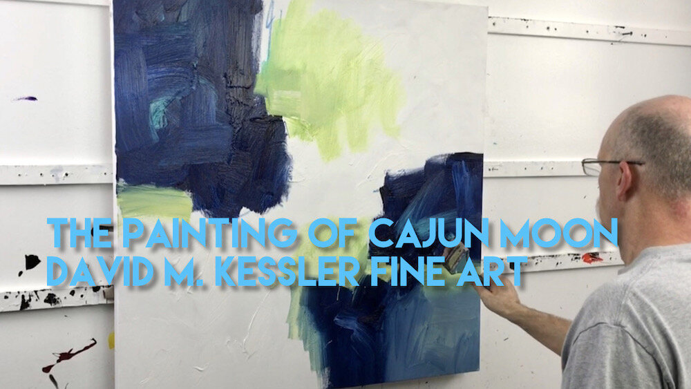
I begin by mixing the Pyrrole Orange into all the blues and mixing Cadmium Red Medium Hue into all the greens to neutralize the colors (reduce their intensity). I mix Benz Yellow Light into the muted Titan Green Pale and into Jenkins Green to make my yellow-greens. I then add a little Titanium White to all the mixtures to lighten the value as needed.
I start by laying out my large dark and dark middle value shapes with a Marabu Art Crayon. I then make some initial loose shapes with the Indigo Blue mixed with a small amount of Titanium White. Once I have located these large shapes i can introduce the base yellow-green color for my accents (centers of interest).
Once the darks and lights are in, I’m ready to add my middle values to the remainder of the canvas. I work the edges of the large shapes and try to integrate the accent colors into the blue and blue-green middle values. I randomly pick the blues and blue-greens off the palette and intermix them freely on the surface, being sure to leave some beautiful brushstrokes as I go. I look at the shapes and values as I paint, adjusting constantly as the painting progresses. Once I’m satisfied with the result, I stop painting. The last thing I want to do is noodle the painting to death. A fresh, lively painting is always better than an overworked painting. The paint is too wet for a signature, so that gets added later.
If you'd like to learn about abstract painting and making your own authentic work, then please join me for a painting workshop: (You can view a list of remaining 2020 workshops HERE)
July 15-17 David M. Kessler Fine Art Studio, Winston-Salem, NC. For information and registration Click Here. Only 3 Seats Left!
August 20-22 Huntsville Museum of Art, Huntsville, AL. For information and registration Click Here.
September 9-11 David M. Kessler Fine Art Studio, Winston-Salem, NC. For information and registration Click Here.
September 18-20 Santa Fe Artist Getaway, Santa Fe, NM. For information and registration Click Here.
November 4-6, 2020 David M. Kessler Fine Art Studio, Winston-Salem, NC Click Here for Information and Registration
November 14-15, 2020 Art of the Carolinas, Raleigh, NC Click Here for Information and Registration
December 2-4, 2020 Hill Country Arts Foundation Ingram, TX Click Here for Information and Registration
As always, thanks for your support!
David
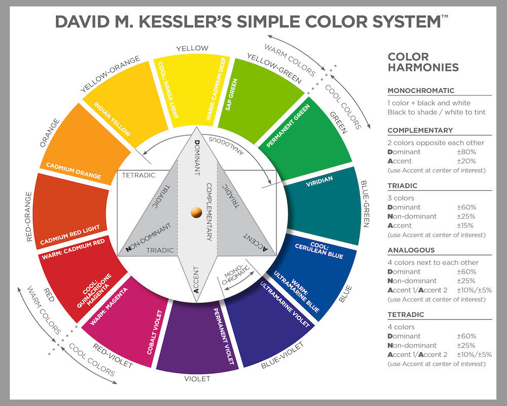
Simple Color System Colorwheel
If you have seen my videos on YouTube or taken one of my workshops, you have seen me use my Simple Color System Colorwheel. My Simple Color System is easy to use and assures that the color in your paintings will be harmonious. Proudly made in North Carolina.
You can purchase the Colorwheel HERE.

ALL ABOUT COLOR is a great online course that will show you a straightforward, no nonsense, clear and easily understandable approach to using harmonious color in your paintings.
Click Here to Learn More and Get a Special Discount of $50 Off

The Painting Insider (formerly Abstract Painting Insider) now has a new format and is not abstract painting specific. Weekly lessons provide an abundance of information to painters at any level. I have poured information about everything I have learned about painting over the last 30 years into one course! On Sale now for a limited time save 30% over the monthly price!