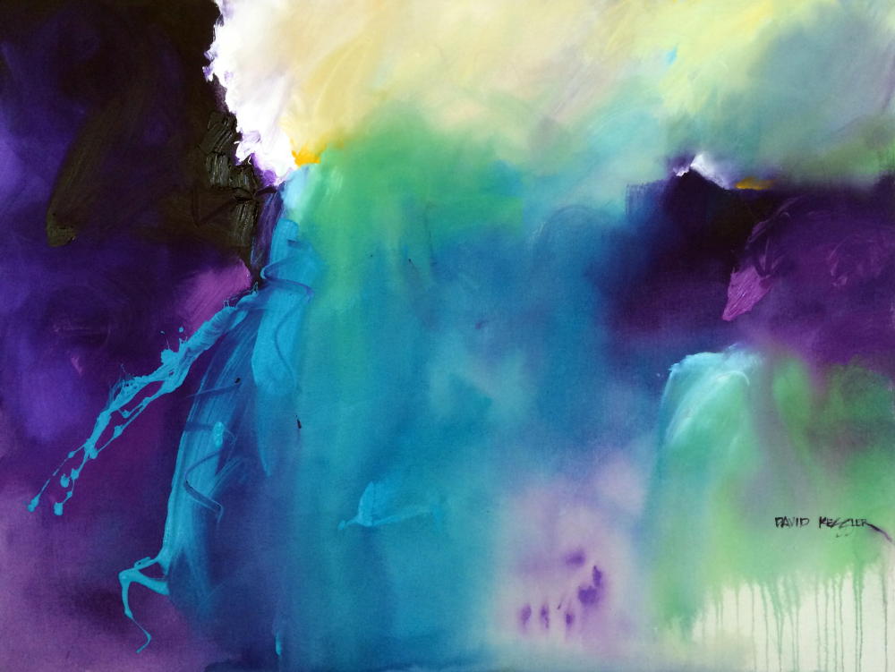
The Painting of "Aqua Fusion"
/
The Painting of “Aqua Fusion”
This is the second painting in a series using a single color family combined with black, white and gray. This is a variation on a monochromatic color combination. In a monochromatic combination you would use only one color plus black and white.
I am using a very limited palette for this painting utilizing GOLDEN Heavy Body Acrylics:
Teal
Minty G (custom mixture of Pthahlo Green, Benz Yellow Light, Pyrrole Orange and Titanium White)
Cobalt Turquoise
Viridian Green Hue
Neutral Gray 4
Neutral Gray 6
Mars Black
Titanium White
Marabu Art Crayons:
Turquoise
White
Aqua Green
Light Gray
This piece is being painted over a previous painting. You might notice the black painted edges on the canvas - a signal that there is a previous painting underneath. I simply gessoed over the previous piece. The resultant surface is a nicely textured one on which to begin a new painting.
I begin by putting in a few middle value gray shapes using Neutral Gray 4 and 6 . These initial shapes get me warmed up and loose. As I said in the previous post, my process is intuitive, so I don’t really think about what I am doing in the first part of a painting. I want the painting to evolve naturally. My goal is to paint using the color combination I have chosen - that’s about it.
I then begin to add in a variety of blue-greens around the surface, not working in any one area too long. Once I have a feel for the middle value shapes, I begin to add in my darkest values. These dark value shapes give a richness and depth to a painting, providing much needed contrast. Students should pay particular attention to the way the dark value shapes are integrated into the rest of the painting. The edges are blended out so that the darks appear to emerge from the painting, rather than look like they are cutouts sitting on top of the painting.
Students should also pay attention to the many ways that I manipulate a flat brush. A wide, flat brush is a magical tool that creates many variations of strokes and marks across the surface. If you use it only one way you will be robbed of the variety that can be achieved across the surface of your painting. I also make a point to move my brush across multiple shapes, pulling with it some of the color of those shapes. This helps me to erase edges between shapes and integrate the color throughout, avoiding the dreaded “color-block” look.
I then begin to lay in a few lighter values next to my darkest values, setting the stage for the highest contrast centers of interest. I introduce the art crayons, which provides some line work across the shapes. I use multiple colors (darker over the light shapes and lighter over the dark shapes) for interest and contrast. The crayon marks help to enrich the visual texture of the surface in a subtle way.
One of my last steps is to lay in the lightest light values next to my darkest dark values, thus establishing my centers of interest. Note how quickly and lightly I put in these values. I lightly add them on top of the light middle value colors already in place. These touches of the lightest value provide needed contrast and extra punch at the most important areas of the painting, thus creating a hierarchy of importance. Remember, if you make everything the same level of importance, then nothing is important.
I finish the painting off by lightening the upper left corner and adding more calligraphy with the crayons - and voila, it’s complete.
If you'd like to learn about abstract painting and making your own authentic work, then please join me for a painting workshop: (You can view a list of workshops HERE)
November 4-6, 2020 David M. Kessler Fine Art Studio, Winston-Salem, NC Click Here for Information and Registration. Only 2 Seats Left!
December 2-4, 2020 Hill Country Arts Foundation Ingram, TX Click Here for Information and Registration
January 13-15, 2021 Murrell's Inlet, SC. Abstracting the Coastal Landscape (NEW). This workshop will be held in the David M. Kessler Fine Art Studio Murrell’s Inlet location. Click Here for Information and Registration
February 3-5, 2021 David M. Kessler Fine Art Studio, Winston-Salem, NC Click Here for Information and Registration
February 19-21, 2021 Art League of Daytona Beach, Daytona Beach, FL Email Amelie Bush: amelieartist@aol.com.
March 12-14, 2021 Arts and Design Society of Fort Walton Beach, FL. Abstracting the Coastal Landscape. Email Hanna Joensuu: hanna222@cox.net.
As always, thanks for your support!
David
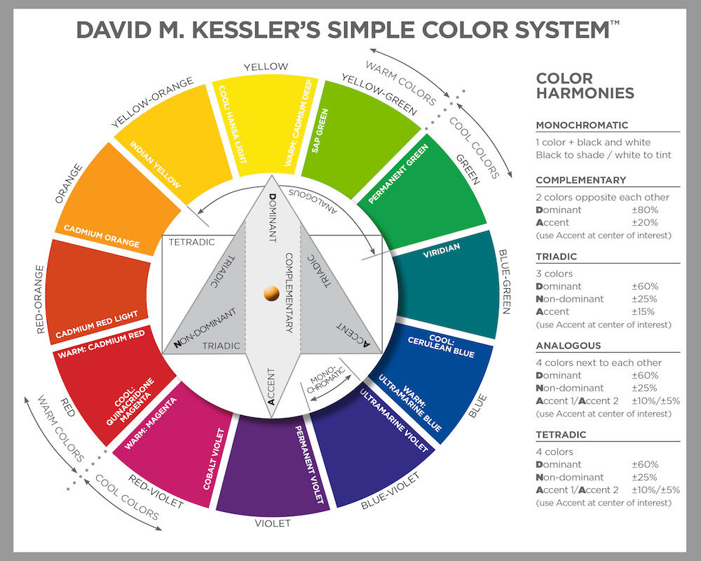
Simple Color System Colorwheel
If you have seen my videos on YouTube or taken one of my workshops, you have seen me use my Simple Color System Colorwheel. My Simple Color System is easy to use and assures that the color in your paintings will be harmonious. Proudly made in North Carolina.
You can purchase the Colorwheel HERE.
Have Put My Online Workshops On Sale Again Because I know How Hard it is to Travel to Workshops Right Now. You can see a full list of my Online Workshops Here.

ALL ABOUT COLOR is a great online course that will show you a straightforward, no nonsense, clear and easily understandable approach to using harmonious color in your paintings. On Sale Now-Save $50!

Abstract Painting Academy is an online workshop experience specifically designed to teach you how to paint Abstract Paintings (like only you can!), Loosen Up your painting style, and use Design Fundamentals to give your paintings Dynamic Visual Impact. You get David’s personal attention and feedback on all of your work during the course. On Sale Now-Save $100!
Click Here to Find Out More

The Painting Insider (formerly Abstract Painting Insider) now has a new format and is not abstract painting specific. Weekly lessons provide an abundance of information to painters at any level. I have poured information about everything I have learned about painting over the last 30 years into one course! On Sale Now-Save 30% Off the Monthly Rate!