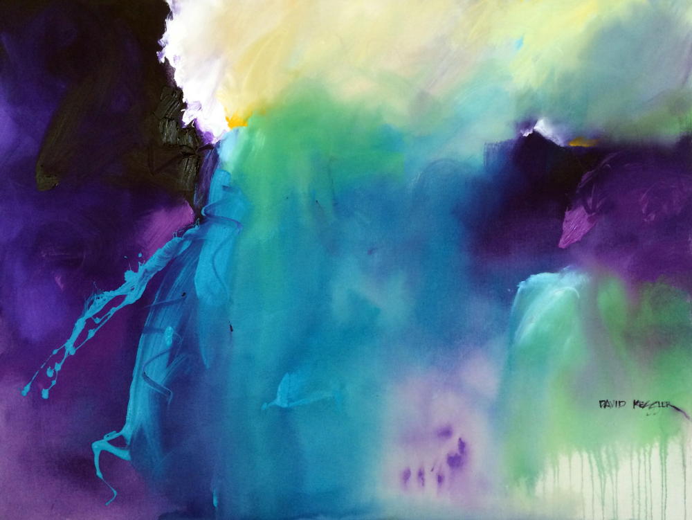
The Painting of "Pieces of a Dream"
/
The Painting of "Pieces of a Dream"
I decided to do things differently in this video. I normally would edit the video to a length of between 4-6 minutes and add music. This time I decided to provide an almost unedited, uncut video showing in real time how long it took to do the painting. The only thing I edited out was a couple segments where I looked at the painting for a couple of minutes during the painting process (to check my shapes and values). There is no music, so feel free to listen to your own while you watch. I thought you might enjoy a different approach.
The colors used for this video are the following Golden Heavy Body Acrylics:
Benzimidazalone Yellow Light
Yellow Ochre
Pyrrole Orange
Medium Magenta
Quinacridone Magenta
Ultramarine Blue
Cobalt Violet
Teal
Cobalt Turquoise
Neutral Gray 6
Titanium White
I wanted this painting to very neutralized (not as bright) as many of the paintings I do, so there was lots of work to do on the palette prior to painting. I also wanted less contrast than I typically have in a painting. I am utilizing a triadic color combo of red-violet (dominant), blue-green (non-dominant) and yellow-orange (accent). - although honestly the red-violet sorta comes off as the accent.
I used the complements of all the colors to reduce the intensity, then I added some Neutral Gray 6 if needed, and lots of white paint (white also reduces the intensity of most colors). It took longer to mix the colors than it did to do the painting. When you have a color direction and you know how you will appropriate the colors in the painting (dominant, non-dominant, accent), then most of the color work is done before painting. This leaves very few color decisions to make as you paint, which is a good thing.
You can see the rest, so no description is necessary. Let me know if you have any questions.
If you can benefit from learning the fundamentals of painting design - Like Shape Making and Color Selection - I have a course called Design Fundamentals for the Artist that you can learn about HERE.
If you'd like to learn about abstract painting and making your own authentic work, then please join me for a painting workshop: (You can view a list of workshops HERE)
August 4-6, 2021 David M. Kessler Fine Art Studio, Winston-Salem, NC. This is a Studio Workshop in Abstract Painting. Click Here for Information and Registration. Only 1 Seat Left!
September 1-3, 2021 “Bigger, Faster, Fresher, Looser Abstract Painting” Ingram, TX
Hill Country Arts Foundation Click Here for Information and RegistrationSeptember 23-25, “Bigger, Faster, Fresher, Looser Abstract Painting” 2021 Huntsville, AL
Huntsville Museum of Art Click Here for Information and RegistrationOctober 8-10, 2021, “Abstracting the Coastal Landscape “ Fort Walton Beach, FL
Arts and Design Society (ADSO). Click HERE for Information and Registration.October 26-28, 2021 “Bigger, Faster, Fresher, Looser Abstract Painting” Daytona Beach, FL
Art League of Daytona Beach, Click HERE for Information and RegistrationNovember 3-5, 2021 David M. Kessler Fine Art Studio, Winston-Salem, NC. This is a Studio Workshop in Abstract Painting. Click Here for Information and Registration.
November 13-14, 2021 Art of the Carolinas, Raleigh, NC. Sponsored by Jerry’s Artarama. I will be teaching two full-day abstract painting workshops. Click Here for Information and Registration.
As always, thanks for your support!
David

Simple Color System Colorwheel
If you have seen my videos on YouTube or taken one of my workshops, you have seen me use my Simple Color System Colorwheel. My Simple Color System is easy to use and assures that the color in your paintings will be harmonious. Proudly made in North Carolina.
You can purchase the Colorwheel HERE.

ALL ABOUT COLOR is a great online course that will show you a straightforward, no nonsense, clear and easily understandable approach to using harmonious color in your paintings. Now On Sale for $50 Off!
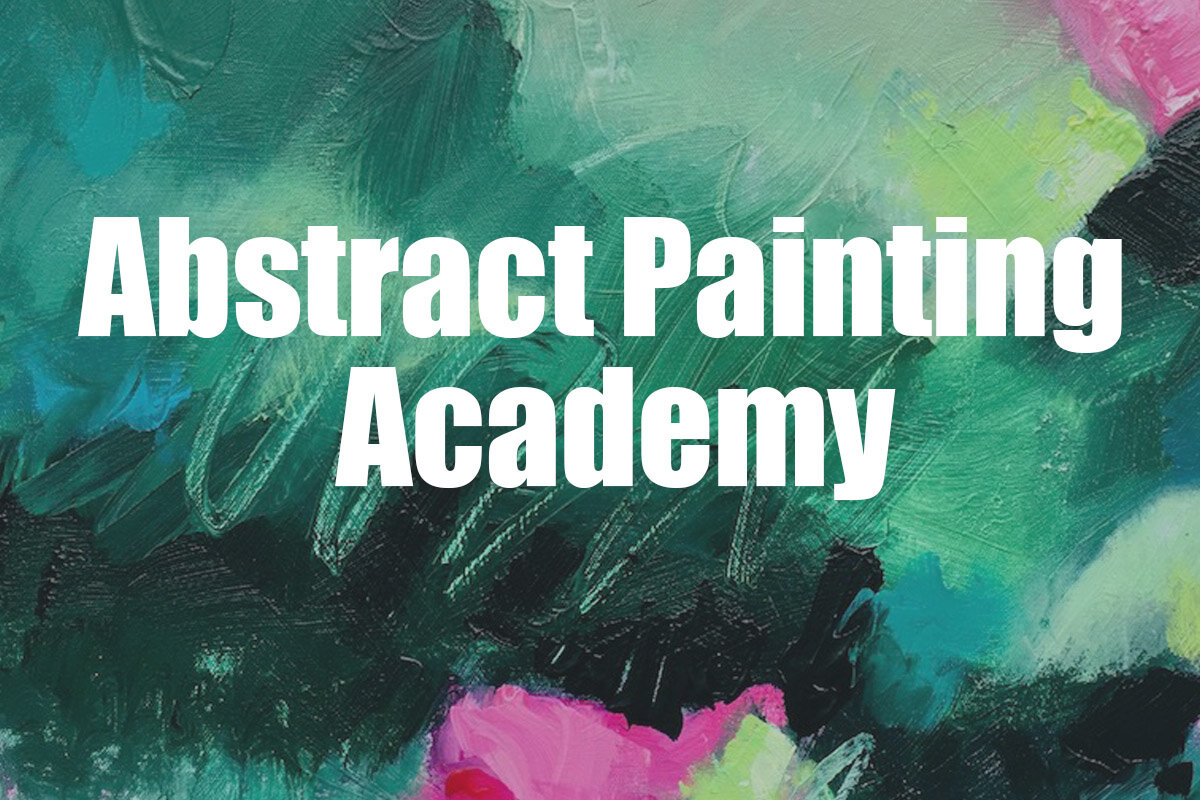
Abstract Painting Academy is an online workshop experience specifically designed to teach you how to paint Abstract Paintings (like only you can!), Loosen Up your painting style, and use Design Fundamentals to give your paintings Dynamic Visual Impact. You get David’s personal attention and feedback on all of your work during the course. Now On Sale for $100 Off!
Click Here to Find Out More

The Painting Insider (formerly Abstract Painting Insider) now has a new format and is not abstract painting specific. Weekly lessons provide an abundance of information to painters at any level. I have poured information about everything I have learned about painting over the last 30 years into one course!